Keep In Touch
My inaugural app design aimed to create a platform for mothers to stay connected with work during their maternity leave
For my UX Design diploma, I created an app tackling the maternity leave gap at work, inspired by my experience in the corporate world where several colleagues took maternity leave.
This comprehensive case study shows my full UX design process, including interviews, sketching, wireframing, testing, branding, and beyond.
Project
Solo Academic Project: UX Design Diploma
Role
UX/UI Designer
Duration
12 Weeks (2023)
Tools
Figma


Everybody thinks that in Canada because we have maternity leave, that it’s good enough.
But maternity leave in Canada really separates women from the workplace.
- CBC NewsThere is stigma associated with taking maternity leave
THE PROBLEMDuring my corporate experience, I observed bias against working mothers, as motherhood and maternity leave were seen as obstacles to their careers.
Though some progress has been made, expectant mothers still hesitate to talk about leave due to stigma.
95%
of mothers reported a lack of formal support during their transition
33%
of mothers faced workplace discrimination based on their status as mothers
69%
of mothers were not given options to stay in touch with their workplace during maternity leave
Source: Moms At Work Survey (Canada, 2021)PRIMARY RESEARCH & KEY THEMESI interviewed former colleagues on maternity leave, identified key themes through Affinity Mapping, and focused on the core theme of 'Maintaining Connectivity' for my app.
Mothers value workplace connection for belonging, even when not physically present. This theme strongly reflected my interviewees' frustrations and motivations.
Click image to enlargeMY NORTH STARThe question that guided my design process
How might we help first-time expectant mothers who work in Canadian corporations overcome maternity leave challenges by improving workplace communication in order to reduce the impact on their careers?

PERSONAMeet Beatrice
I focused on first-time experiences of experienced mothers to create a profile for new moms on maternity leave (simplified persona presented herein).

Based on Beatrice's insights, I created an experience map to identify design opportunities for improved maternity leave (simplified version presented herein).
EXPERIENCE MAP
USER STORIESI wrote user stories and defined a main epic as "Staying Connected with the Manager".
I created a task flow "Scheduling Check-Ins with the Manager" to aid Beatrice during her maternity leave low. Below are the key user stories that shaped my task flow.
Click to enlargeAs a mother on maternity leave…
I want to receive check-in reminders so that I can stay connected with my manager and team
I want to set my preferred check-in frequency so that I can customize the communication to fit my needs and schedule
I want to have access to my manager's availability so that I can conveniently schedule a check-in with them
SKETCHES TO WIREFRAMESIn my UI search, I explored reminder, news, forum, fitness, and appointment apps. I sketched, refined, and translated to wireframes.

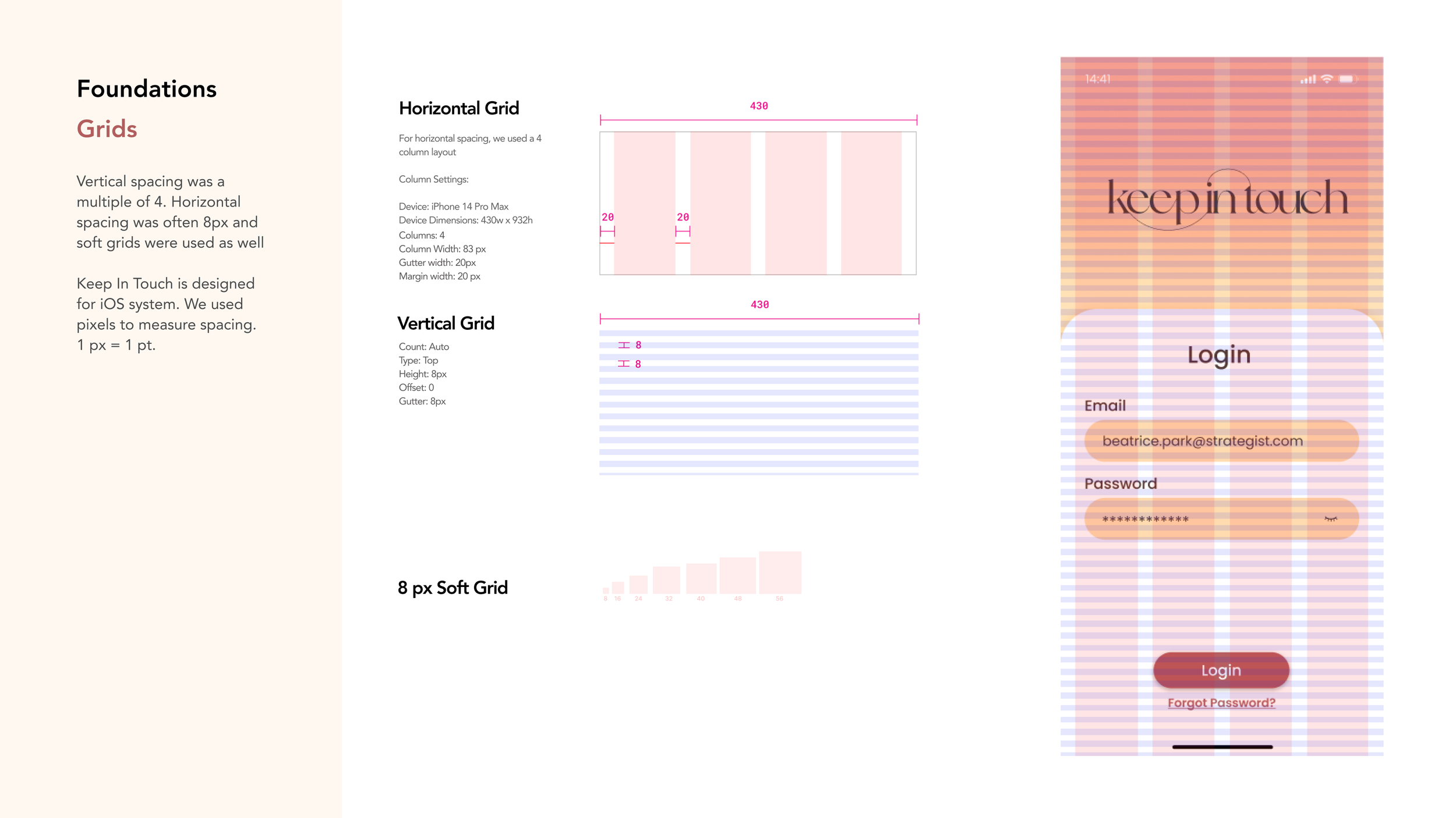
Login Screen

Onboarding

Home Screen

Schedule Check-In

Check-In Confirmation
USABILITY TESTINGFrom two usability tests, key issues were identified: refining language on onboarding screens, check-in reminders, and making minor cosmetic adjustments.
Deemed as low-effort, high-impact based on the Design-Prioritization matrix, I implemented all the changes.


BRAND IDENTITYTo begin creating a visual identity for ‘Keep In Touch’, I crafted a moodboard, drawing inspiration from the beauty of sunsets.
Elegant
Refined
Calming
Welcoming
Elegant Refined Calming Welcoming

COLOUR For my brand and app, I chose a neutral colour palette with a pop of yellow as the same creates a warm and vibrant feel.

I joined the letters ‘KIT’ since this abbreviation will shape the icon version of my wordmark.
For the app icon, a circle was incorporated to symbolize connectivity and inclusivity.
WORDMARKUI LIBRARY Take a peek into the UI Library, designed following the principles of the Atomic Design Methodology.


RESPONSIVE WEB DESIGNI designed a marketing website for 'Keep In Touch' to highlight the app's key features and brand identity, optimized for both desktop and mobile displays.
Drawing inspiration from SaaS companies, I targeted employers directly.
View Figma Prototype (Desktop) →
View Figma Prototype (Mobile) →
KEY LEARNINGSIn retrospect, I would have liked to conduct more user interviews to deepen my understanding of the problem space.
Nonetheless, this project improved my grasp of UX Design fundamentals. I loved expressing creativity through ideation, sketching, branding, and refining designs
DESIGN IMPACTS & FUTURE THINKINGIf ‘Keep In Touch’ were widely adopted and used, I hope that it would:
Challenge gender-related stereotypes and biases, not only within corporate settings but also across broader society
Contribute to a cultural change where the integration of work and family becomes more accepted